Digital Graph Paper: Grid Templates for Tablet Note-Taking Apps
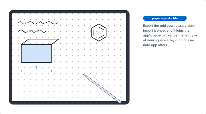
Every tablet note-taking app ships with a paper picker, and every one of them stops at roughly the same place: plain, ruled, a square grid at one size, a dot grid at one size, and if you are lucky, something calling itself Cornell. That set covers the first week. It does not cover the person who wants four-millimeter squares because their handwriting is small, or a chemist who wants a hexagonal sheet, or a draftsman who wants engineering ruling with a heavy line every fifth square, or anyone whose work happens on a grid the app's designers did not think of. The fix is not a different app. It is a template file: an image of exactly the grid you want, at exactly your page size, imported once and then available forever as paper you can start a new page on. This article covers how to make one, how to choose between the two export formats, the page-shape mistake that ruins most first attempts, and how the import works across the apps people actually use.
Where the Built-In Papers Run Out
The built-in grids are a compromise made on your behalf. An app that ships one square paper has to pick a square size, and the size it picks is almost always five millimeters, because five millimeters is the European school standard and it is defensibly average. Average is the problem. Grid size is the one setting that should track the size of your own handwriting, and handwriting varies enormously between adults -- our guide to choosing the right grid size works through the reasoning, but the short version is that a grid you have to write across two rows of is a grid that is fighting you, and so is one where your letters rattle around inside a single cell.
The second limit is the shape of the grid rather than its size. Square and dot are the two the apps agree on. Everything else -- isometric, hexagonal, polar, logarithmic, engineering ruling -- is missing from every mainstream note app, and each one belongs to a discipline that does a lot of writing on a tablet. Chemistry students draw ring structures. Game masters draw hex maps. Engineers plot on semi-log axes. None of them are served by a picker with five entries in it.
A template file closes both gaps at once, because the file is just an image and the app does not care what is drawn on it. Set the grid you want, export it, import it as paper, and the app's own limitations stop applying.
SVG or PNG: Choose by How Far You Zoom
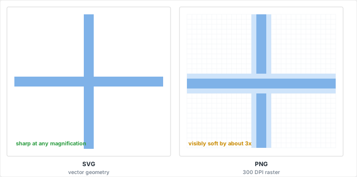
The generator offers two downloads, and they fail in different ways rather than one being better. The SVG is vector: the file describes the lines as geometry, so it stays exactly as sharp at twelve times magnification as it is at fit-to-screen. The PNG is a raster, produced by drawing that same vector artwork onto a canvas at 300 dots per inch. At A4 that comes out around 2480 by 3508 pixels, and at US Letter around 2550 by 3300.
Three hundred DPI is a print resolution, chosen so the same download works on a printer, and at page size it is comfortably enough for a screen. A 12.9-inch tablet has a display resolution near 265 pixels per inch, so a 300 DPI raster shown at true page size carries slightly more detail than the panel can actually resolve, and looks perfectly crisp. The margin is thinner than that sounds, though, because it is spent as soon as you zoom. At twice page size those same 300 samples per inch are being stretched across roughly 530 device pixels per inch, a 1.8x upscale that is soft but perfectly usable. By three or four times it is visible on a fine grid, and beyond that it is obvious. For writing, none of this matters -- nobody takes notes at 4x. For inspecting a small diagram closely, it does.
So the rule is straightforward. If the app accepts SVG, take the SVG, because it has no failure point at all. Most of them do not: the major note-taking apps take images and PDFs, and PNG is the image format they all handle without complaint. Take the PNG, and stop worrying about the resolution unless you are zooming far past what writing requires. The one case where the distinction genuinely bites is a very fine grid -- two or three millimeters -- where the lines are only a handful of pixels apart to begin with, so there is much less margin before they start blurring into each other. If you want a fine grid and the app will take a PDF, use the PDF route described further down, which keeps the lines as vectors.
One thing both formats share is worth knowing before you import: the exported file has an opaque white background. It is a sheet of paper, not a transparent overlay. That is the right behavior for a paper template and the wrong behavior if you were hoping to float a grid over an existing page, which no export from this tool will do.
Match the Page Shape Before You Export
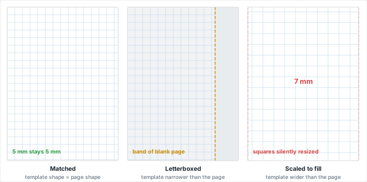
This is where most first attempts go wrong, and the symptom is subtle enough that people blame the app. A note-taking app's page has a fixed aspect ratio, chosen when you create the notebook. Your template has an aspect ratio too, set by the paper size you exported at. When the two disagree, the app has to resolve it, and it will either letterbox your template -- leaving a band of blank app-colored paper down one edge where your grid simply stops -- or scale it to fill and crop the overflow, which quietly cuts squares off two sides and, worse, changes the size of every remaining square.
That second failure is the dangerous one, because nothing looks broken. The page is full of grid. It is just no longer the grid you asked for: a 5 mm square that has been scaled to fill a page of a different shape is not 5 mm any more, and if you were relying on the grid to mean something -- a floor plan at a scale, a chart with real units -- the drawing is now wrong in a way you will not notice until you measure it.
Avoiding it takes one step. Find out what page size your notebook uses, then set the same one in the generator's paper preset before exporting. Almost every app defaults to either A4 or US Letter, and both are presets here. The two are close enough in shape to look interchangeable and are not: A4 is 210 by 297 mm, a ratio of about 1:1.414, while Letter is 8.5 by 11 inches, about 1:1.294. Dropped into each other's pages, that difference is a visible strip of missing grid, or several millimeters of crop. Our guide to paper sizes covers where the two standards came from and why the mismatch is permanent.
If you are creating the notebook from scratch, the easier order is the reverse: export the template first, then create the notebook and let the app take its page size from the imported template, which several of them will do.
Getting the Template Into Your App
The mechanism is the same everywhere -- hand the app an image, tell it to treat that image as paper -- but the wording differs, and the menu names move between versions often enough that it is not worth memorizing any particular path. What follows is the mechanism in each app, which changes far more slowly than the labels do.
GoodNotes and Notability
These two have the most complete support, because both let you add your own paper alongside the built-in set rather than treating an import as a one-off. In GoodNotes, custom templates live in the same picker as the stock papers: add the PNG to the template library, and from then on it appears as an option whenever you create a notebook or add a page, including inside notebooks you have already started. Notability works the same way through its paper settings. Import once, and the grid becomes a permanent part of the app rather than something you re-import per document.
Both handle portrait and landscape as separate templates. If you work in both orientations, export twice, swapping the width and height values in the generator, and import each. An app asked to rotate a portrait template into a landscape page will stretch it rather than re-flowing it, which puts you back in the scaling problem from the previous section.
OneNote and Samsung Notes
OneNote is the awkward one. It has its own rule-line and grid-line settings, which are genuinely useful and completely fixed -- a handful of sizes, square only -- and it has no custom paper feature on the tablet versions. The workaround is to insert the PNG as a picture, size it to the page, and set it as a background image, which pins it in place so your writing goes on top rather than dragging the grid around. It works, but it is per-page rather than per-notebook, so it suits a document you are about to fill with one kind of drawing more than it suits a general notebook.
Samsung Notes sits between the two camps. It has a template picker with more range than OneNote's, and it will import a PDF as pages, which is the more reliable route into it than trying to register a custom paper. That makes the PDF trick in the next section the one to reach for.
Drawing and Design Apps
Procreate, Concepts, Affinity and their peers have no concept of paper at all, which turns out to be simpler. Import the file as a layer, drop its opacity a little if the grid is competing with your line work, and lock it. Everything you draw lands on layers above it, and at the end you hide the grid layer and the drawing is clean -- the digital equivalent of the light-blue non-photo lines that never showed up when a drawing was reproduced. This is the natural way to work if you are using the grid the way our article on the grid method for drawing describes, where the grid is scaffolding to be removed rather than part of the finished piece.
When the App Wants a PDF
Several apps prefer a PDF, and some accept nothing else for multi-page imports. The generator has no PDF button, but the browser does the job perfectly well and produces a better file than an image would: use the print control, then choose "Save as PDF" as the destination instead of a printer. What you get is a true single-page PDF at the exact page size you set, with the grid as vector artwork rather than pixels, so it stays sharp at any magnification the way the SVG does.
This is the best route for Samsung Notes, for any app that imports PDFs as notebooks, and for anyone who wants a multi-page template. To get one, save the single page and then combine copies of it into a longer document with whatever PDF tool is already on the machine. Our printing tips cover the settings that matter when the destination really is a printer, and most of them -- scale set to 100%, no fit-to-page -- matter just as much when the destination is a PDF, for the same reason: anything that rescales the page changes what a square is worth.
Line Weight and Color for a Backlit Screen
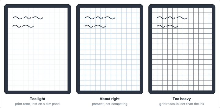
A grid printed on paper and the same grid on a tablet are read under completely different conditions, and the settings that work on one are usually wrong on the other. Printed grid lines are conventionally very light -- pale blue or light gray -- because the paper is lit by the room, the ink is opaque, and a line that is barely there is still perfectly visible when you put your eye near it. A screen is emissive and usually running at half brightness or less, often in a dark room where you have turned it down further. The palest gray that reads beautifully on paper can vanish outright under those conditions.
So bias one step darker than you would for print. If you would print a grid in a light gray, pick the next tone up for the tablet. The generator's line weight control matters here too, and the useful move is the opposite of the intuitive one: on a high-resolution display a hairline is rendered honestly rather than being thickened by ink spread, so a weight that looks correct in the print preview can come out visually thinner on the panel than it does on paper.
The other screen-specific issue is dark mode. Note-taking apps that offer a dark theme usually invert their own paper, and they will not invert yours -- your template is an image with a white background baked into it, so it stays a bright white rectangle in a notebook where everything else has gone dark. There is no setting that fixes this; it is a consequence of the export being a picture of a sheet of paper. If you work at night in a dark-themed app, the honest answer is that an imported template will be the brightest thing on the screen, and the app's own built-in grid, whatever its limitations, is the one that follows the theme.
Grids Worth Importing
The grids that repay the effort of making a template are the ones no app offers. A dot grid is the exception that is usually built in, but rarely at a size you would choose, and it remains the best all-purpose paper for a tablet for the same reason it is on paper: the dots position your writing without appearing in it, which matters more on a screen where the grid is emitting light rather than reflecting it. If you keep a digital bullet journal, a dot grid at your own spacing is the single highest-value template to make.
Hexagonal paper is not in any mainstream note app, and it has two large audiences on tablets. Chemistry students draw ring structures on it, which is the subject of our article on drawing organic chemistry structures, and game masters draw overland maps. The generator will also number the hex cells for you across a range you choose, which is worth knowing about because a numbered hex map is the format most tabletop referees actually want and no note app will produce -- our piece on tabletop RPG maps goes into how the numbering gets used at the table.
Engineering ruling, with a heavier line every fourth or fifth square, gives you a countable grid: you read position by counting heavy lines rather than squinting at identical faint ones, which is the difference between a grid you can measure on and a grid you can only write on. Isometric paper handles anything three-dimensional and is the right base for the kind of work in our design sketching tutorial. Polar and logarithmic grids are narrower still, but if you need them you need them badly, and the alternative on a tablet is nothing at all. For plotting functions and working through problem sets, the approach in our math graphing tutorial transfers to a tablet unchanged once the axes are underneath you.
One more, less obvious: a fine square grid makes a serviceable handwriting guide. The techniques in our article on handwriting practice depend on consistent x-height and slant, and both are easier to hold on a grid than on ruled lines. On a tablet it has the advantage that a page costs nothing, so the practice can be as repetitive as it needs to be.
Working to Scale on a Tablet
Scale drawing is the use case where the page-shape warning stops being pedantry. If you are laying out a room, one square has to equal a fixed real distance -- a foot, a quarter meter -- and every measurement you take off the drawing later depends on that relationship holding. Our room layout tutorial works through choosing a scale that fits the space onto the page, and the method is identical on a tablet, with two differences worth planning around.
The first is that scaling is now silent. On paper, a plan printed at the wrong scale usually announces itself: the page is visibly too small, or the drawing runs off the edge. On a tablet a mis-scaled template still fills the page perfectly, so the only defense is the one already described -- export at the notebook's page size and never let the app resize the template.
The second is that a tablet is unusually good at the part of scale drawing paper is bad at, which is trying a layout more than once. Furniture drawn on its own layer can be moved, duplicated and thrown away without touching the grid or the walls, which is the digital version of the cut-out paper furniture templates the tutorial recommends, minus the cutting. The same holds for anything laid out on a grid and revised: garden beds, quilt blocks, and game level layouts all benefit more from cheap revision than they lose from being on a screen.
Mistakes That Cost You a Notebook
The costly errors here share a shape: they are invisible at import and expensive fifty pages later, once the notebook is full of work sitting on a template you cannot change.
Exporting at screen size instead of page size. The template should be the size of a sheet of paper, not the size of your tablet's display. Page size is what the app is scaling against, and a template built to a display's dimensions will be resized to fit, taking the grid spacing with it.
Guessing at the notebook's page size. A4 and Letter look similar and are not. Check which one the notebook uses before exporting rather than after, because changing a notebook's page size once it has pages in it generally is not possible.
Choosing the grid size by how it looks zoomed in. Everyone sets up a new template zoomed to about 150%, where a 4 mm grid looks comfortable and roomy. Written on at fit-to-screen, where you will actually use it, that same grid is cramped. Zoom to the level you write at before deciding.
Making one template and settling. The whole advantage of a template over built-in paper is that the marginal cost of another one is a minute. A 4 mm dot grid for daily notes, a 5 mm square for anything quantitative, an isometric sheet for sketching and a hex sheet for maps is four exports and four imports, and it means never again adapting your work to the paper the app happened to ship.
Assuming the template is a backup. It is not, and neither is the notebook. A template lives in one app on one device. Keep the export, or at least the settings that produced it, somewhere you will find it again when you replace the tablet.
Conclusion
A note-taking app's paper picker is a default, not a limit. Underneath it, every one of these apps is willing to treat an image as a page, which means the grid you write on is a decision you get to make rather than one that was made for you by whoever specified the app's five stock papers. Set the grid size to your own handwriting, choose the ruling that matches the work, match the page size to the notebook, export, and import once. The whole operation takes about two minutes, and it is the difference between a tablet that approximates the paper you would have chosen and one that is running exactly it.
Related Resources
- Dot Grid Paper -- the best all-purpose template to start with
- Hexagonal Graph Paper -- with cell numbering no note app offers
- Isometric Graph Paper -- for anything three-dimensional on a tablet
- Bullet Journaling with Graph Paper -- the method that most rewards a custom dot grid
- Room Layout Planning -- scale drawing, where page size stops being cosmetic
- Design Sketching on Grid Paper -- layered grids in a drawing app
- The Grid Method for Drawing -- a grid built to be hidden at the end
- Creating Pixel Art on Graph Paper -- one square, one pixel, on any screen
- The Hexagon Habit Tracker -- a numbered month that imports as a page template